Incorporating the Color Red to Ignite Dynamic Energy in Your Space
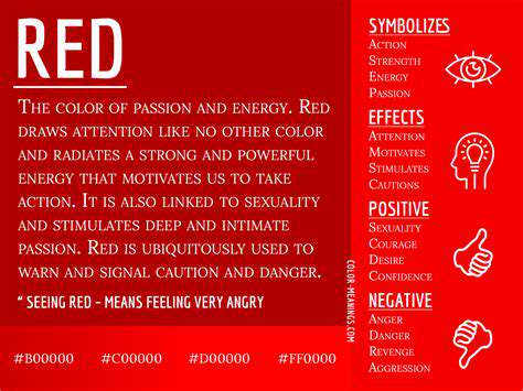
The Psychological Impact of Red
The Symbolism of Red
The color red has a rich history of symbolism across various cultures. In many societies, it represents love, passion, and desire, making it a powerful choice for settings intended to evoke intense emotions. Understanding the cultural context of red can deepen your appreciation for its use in interior design.
On the flip side, red can also symbolize anger and danger, which means its placement requires careful consideration. When used in the right context, however, it can transform a space into one filled with excitement and vitality. Incorporating red thoughtfully can balance its intense nature with warmth and comfort.
In addition to its emotional implications, red can also signify strength and confidence. It has the ability to energize a room and create an atmosphere of assertiveness. This aspect makes it an excellent choice for creative spaces and offices where motivation is key.
Using Red in Different Spaces
Red can be employed in various areas of the home to achieve different effects. In the living room, for example, red accents such as cushions, throws, or artwork can create a welcoming and stimulating environment. It's also a great choice for dining rooms, where it can enhance appetite and conversation.
In the bedroom, however, the use of red needs to be thoughtful. Too much red in a space typically associated with relaxation can create an atmosphere of hyperactivity. Instead, consider using softer shades or red patterns to maintain intimacy while still enjoying the benefits of the color.
In commercial spaces like restaurants or retail shops, red is often used to attract attention and encourage spending. Its boldness can draw customers in and keep their energy levels high, making it a strategic choice for business owners wanting to boost interaction.
Complementary Colors for Red
When incorporating red into your decor, it's crucial to consider the colors that complement it. Shades like beige, white, and gray can soften the intensity of red, providing a balanced contrast. This combination creates an inviting atmosphere without overwhelming the senses.
In contrast, pairing red with black can create a dramatic effect, ideal for modern and edgy design schemes. This pairing can elevate the sophistication of a space and instill a sense of bold confidence. However, moderation is vital to avoid overpowering the room with darkness.
Additionally, earthy tones such as olive green or muted browns can harmonize beautifully with red, contributing to a warm, grounded environment. This combination can work well in rustic or organic-themed spaces, promoting relaxation and comfort.
Lighting and Red
The type of lighting used in a space can greatly influence how red is perceived. Natural light can enhance the vibrancy of red, making it look lively and inviting. Conversely, harsh artificial lighting may wash out the color, diminishing its impact.
Soft, warm lighting is often the best choice when red is a primary feature in a room. This type of lighting can create an inviting glow that complements the energetic nature of red without overwhelming it. Choosing the right lighting fixtures can be the key to making red truly shine in your space.
Consider using dimmers to adjust the light intensity, allowing you to create different moods throughout the day. As the sun sets, you can soften the atmosphere, transforming the space into a cozy retreat while still embracing the vibrancy of red.
Getting Creative with Red Accents
If you're hesitant about incorporating red on a larger scale, start with smaller accents. Items like throw pillows, rugs, or decorative vases can introduce the color without fully committing to a bold design. This approach allows you to experiment with different shades and placements.
Artwork featuring red tones can also serve as a focal point, drawing the eye while showcasing your taste in decor. Pairing such art with neutral backgrounds can emphasize its impact and keep the overall design balanced. Allowing red to shine through art can creatively integrate the color without overwhelming your space.
Another innovative way to incorporate red is through plants and flowers. Vibrant red blooms can add warmth and life to a room naturally, bridging the gap between energetic decor and refreshing greenery. This dual approach creates an inviting ambiance that feels both dynamic and peaceful.
Red in Interior Design
Psychological Impact of Red
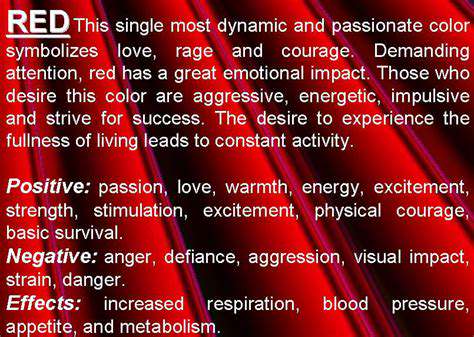
Red is a powerful color that evokes strong emotions and reactions. It is often associated with feelings of excitement, passion, and even aggression. This psychological impact can influence how one feels in a space, making it ideal for areas where energy and enthusiasm are desired, such as living rooms or dining areas.
Studies have shown that the color red can increase heart rates and elevate blood pressure, leading to an invigorating atmosphere. When used thoughtfully, red can energize a room, stirring enthusiasm and engagement among its inhabitants.
However, it is important to balance red with other colors to avoid overwhelming the senses. The right combinations can create a vibrant yet harmonious environment that stimulates activity while providing a sense of warmth and comfort.
By understanding the psychological implications of red, you can strategically use it to create spaces that resonate with vitality and excitement, enhancing both social interaction and personal well-being.
Choosing the Right Shades of Red
Red is not a one-size-fits-all color; it comes in a plethora of shades, each evoking different feelings and settings. Bright shades such as cherry or crimson are lively and bold, suitable for modern and energetic spaces where creativity flourishes.
Darker shades like burgundy or maroon, on the other hand, convey a sense of sophistication and intimacy, making them perfect for bedrooms or libraries where relaxation and enrichment are the focus. Choosing the right shade is crucial to achieving the desired atmosphere.
When selecting reds, consider the amount of natural light in the room. Bright reds can appear too vibrant in well-lit spaces, while darker hues may seem dull. Experimenting with paint samples or fabric swatches in the intended light can help ensure the right choice is made for your design goals.
Ultimately, the chosen shade should align with the overall theme of the space, contributing to a cohesive design that reflects personal style and functional needs.
Complementary Colors to Enhance Red
To achieve a balanced and dynamic interior design, it’s essential to pair red with complementary colors that enhance its vibrancy without overwhelming the space. Neutral colors such as beige, gray, or white can provide a calm backdrop, allowing red to stand out as an accent or focal point.
Additionally, colors like navy blue or emerald green can create a striking contrast with red, adding depth and sophistication. These combinations can be applied through furniture, artwork, or decorative accessories, bringing a cohesive look to the room.
Metallic accents like gold or silver can also work beautifully with red, providing a touch of glamour and elegance. Incorporating these elements can further elevate the energetic vibe that red brings to the space.
Ultimately, the key is to create harmony within the color palette, blending reds with other tones that complement and enhance the overall aesthetic while maintaining the dynamic energy that red provides.
Incorporating Red Accents in Your Decor
If a full red wall feels too daring, consider using red as an accent color in your decor. Accessories such as pillows, throws, or rugs can introduce this vibrant hue in a more subtle way, allowing you to enjoy its energy without overpowering the room.
Artwork featuring red tones can also serve as a focal point, drawing the eye and stimulating conversation. A statement piece or several smaller artworks can effectively showcase red's vibrancy, contributing to the room's overall atmosphere.
Furniture pieces, such as red chairs or tables, can serve as bold accents while allowing the other elements in the room to shine. They can also be easily swapped out or updated as trends change, providing versatility in your design.
Lighting plays a crucial role too; red lampshades or bulbs can cast a warm, inviting glow, further reinforcing the energetic ambiance that red brings. By integrating red accents thoughtfully throughout your decor, you can create a lively yet balanced space that feels vibrant and alive.
Red in Branding and Marketing

Understanding the Psychology of Red
The color red is often associated with strong emotions such as passion, excitement, and urgency. Many studies suggest that warm colors like red can increase heart rates and stimulate energy levels. In environments where people need to feel more engaged, red can create an atmosphere that inspires action.
When considering colors for branding, red is frequently chosen for its ability to create a sense of urgency, making it a popular choice for sales and special offers. This is why you will see many clearance signs in red—it draws attention and encourages quick decision-making. Additionally, red can evoke feelings of warmth and comfort, making it a versatile color in various settings.
Understanding the context in which red is used can help to utilize its energies more effectively. For example, red may be highly effective in marketing food products, as it can stimulate appetite. Conversely, in more calming environments, excessive use of red might lead to agitation.
Ultimately, when harnessing the power of red, it is essential to balance its intensity with other colors to avoid overwhelming your audience. Integrating red with cooler tones can help achieve the desired emotional response without causing stress.
The Impact of Red in Marketing Strategies
Red is commonly used in brand logos and advertisements, as it can invoke strong emotions that often lead to consumer engagement. Companies often incorporate red complementary colors to create a bold aesthetic that makes their brand memorable. This practice can help in establishing a strong identity and recognition among consumers.
Moreover, marketing campaigns that feature red can generate excitement around products, often increasing their perceived value. Limited-time offers in red banners are proven tactics to enhance urgency and drive sales. Using red effectively can change consumer behavior, influencing them to act quickly.
The timing and placement of red in ads are crucial as well. Seasonal campaigns, particularly around holidays like Valentine's Day and Christmas, frequently use red to evoke feelings of love and joy. For this reason, brands need to observe market trends and adapt accordingly when deploying red in their marketing efforts.
In digital marketing, crafting compelling red call-to-action buttons can significantly improve click-through rates. A/B testing can help determine the most effective shade of red to use, optimizing it for higher conversions. Hence, red is not just a color; it's a dynamic tool in the marketer's arsenal.
Utilizing Red in Interior Design and Space Planning
In interior design, red can be strategically used to enhance the energy of a space. When applied thoughtfully, red can make a room feel both intimate and vibrant. Many designers recommend using red as an accent color to add bursts of energy without overwhelming the overall aesthetic.
Red works especially well in areas intended for social gatherings, such as living rooms and dining spaces, where warmth and sociability are desired. Incorporating red through furniture, decor, or artwork can create a focal point that draws attention. However, it's essential to balance red with softer colors to ensure harmony throughout the space.
Additionally, red can be used in workspaces to boost productivity levels. Studies have shown that environments infused with energetic colors can enhance creativity. Designers often suggest painting a single wall red or incorporating red-patterned textiles to keep the energy flowing.
Ultimately, how you incorporate red into your space should align with the desired atmosphere and function of the room. Whether it be through paint, fabric, or decor elements, utilizing red can ultimately lead to a dynamic and invigorating environment that inspires social interaction and creativity.
Practical Tips for Incorporating Red
Understanding the Psychology of Red
The color red is often associated with strong emotions such as passion, love, and excitement. It can stimulate the senses and evoke a sense of urgency, making it an ideal choice for spaces intended for activity and engagement.
Incorporating red into your environment can create a dynamic atmosphere that encourages social interaction and boosts energy levels. By understanding the psychological impacts of red, you can use it strategically to enhance the mood of your space.
Choosing the Right Shades of Red
Not all shades of red evoke the same feelings; thus, choosing the right hue is essential. Bright, bold reds can energize a space while deeper reds can add a touch of elegance and warmth.
Consider the overall aesthetic of your space when selecting a shade of red. For example, a cherry red can create a lively atmosphere in a dining room, while a burgundy may bring warmth and coziness to a living area.
Incorporating Red Through Decor
Red can be integrated into your space through various decor elements, such as cushions, artwork, and rugs. These accents can introduce the color without overwhelming the senses, offering bursts of vibrancy in an otherwise neutral palette.
Another effective approach is to use red as an accent color against a backdrop of more muted tones. This creates a balanced look that still captures the energy and excitement that red offers.
Balancing Red with Other Colors
While red is a powerful color, it is essential to balance it with other hues to prevent it from dominating the space. Pairing red with soft tones like white, beige, or light gray can create a harmonious environment that feels inviting.
Additionally, complementary colors like green can provide a refreshing contrast, helping to ground the vibrancy of red. Experimenting with color combinations is key to achieving a dynamic yet cohesive look in your space.
Read more about Incorporating the Color Red to Ignite Dynamic Energy in Your Space