The role of color in creating a vibrant home atmosphere
List of Contents
Colors influence emotions and moods in space design.
Blue and green promote relaxation; red and orange inspire energy.
Warm colors make spaces feel intimate; cool colors create spaciousness.
Harmonious color schemes evoke calm, while contrast adds excitement.
Cultural meanings of colors affect perception and design choices.
Personal experiences shape individual relationships with colors.
Understand color theory for cohesive and appealing aesthetics.
Select a palette that reflects personality and intended space functions.
Utilize color psychology for desired emotional impacts in design.
Implement accent walls and color techniques to enhance visual appeal.
Integrate color through decor and furnishings for comprehensive design.
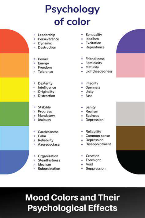
The Psychology of Color and its Impact on Your Space
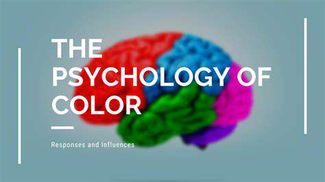
The Emotional Resonance of Colors: A Deep Dive
Colors possess an extraordinary ability to evoke specific emotions and influence our moods, impacting our psychological well-being in significant ways. Understanding this emotional resonance is crucial when designing a space, as it allows for the conscious crafting of an environment that aligns with the desired atmosphere and supports the overall functionality. For instance, the calming influence of blues and greens can promote relaxation and tranquility, making them excellent choices for bedrooms or meditation areas, encouraging the feeling of peace and reducing feelings of stress, which often comes from the busyness of daily life.
Conversely, warm colors like reds and oranges are often associated with energy, excitement, and passion, injecting a sense of vibrancy and dynamism into a room. These stimulating hues can be particularly effective in areas where activity and interaction are encouraged, such as living rooms or dining areas, where you want to inspire lively conversations and gatherings. The skillful application of color psychology is therefore more than just an aesthetic consideration; it's a powerful tool for shaping the psychological experience of a space, and ultimately the quality of life within it. Selecting the right colours depends on a variety of factors.
Color Temperature and its Spatial Effects
The concept of color temperature, differentiating between warm and cool hues, is fundamental to understanding how colors impact the perception of space. Warm colors, with their association with sunlight and fire, tend to advance or appear closer to the viewer, making a room feel smaller and more intimate. This characteristic is particularly useful in large, cavernous spaces where a sense of coziness is desired, and can really make a huge difference in the space. The careful implementation of colours really does play a very important role.
Cool colors, on the other hand, have a receding effect, making a space feel larger and more expansive. Blues, greens, and violets can create a sense of airiness and openness, which makes them ideal choices for smaller rooms or spaces where a feeling of spaciousness is preferred. The ability to manipulate the perceived size of a room through color temperature is a powerful tool in interior design, allowing for a customized aesthetic experience that aligns with both the practical needs and the personal preferences of the inhabitants. Understanding and considering the colour wheel is a very vital factor to be considered for your space.
Color Combinations: Harmony and Contrast
The way colors interact with each other, known as color combinations, is another crucial aspect to consider when designing a vibrant home atmosphere. Harmonious color schemes, which employ colors that are adjacent to each other on the color wheel, such as blues and greens or yellows and oranges, create a sense of calm, unity, and cohesion. Such combinations are visually pleasing and often evoke feelings of balance and serenity, making them suitable for spaces where relaxation and focus are desired, and such a space is typically sought by those who prefer to be at home.
Contrast, achieved by using colors that are opposite each other on the color wheel, like blue and orange or red and green, introduces excitement, energy, and visual interest. A well-executed contrasting color scheme can make a space feel dynamic and visually stimulating, drawing the eye and creating a sense of playfulness. It's essential to strike a balance between harmony and contrast to avoid a space feeling either monotonous or overwhelming. The right amount of each colour makes a very big difference in how the atmosphere looks.
Cultural and Personal Associations with Color
Beyond the general psychological effects, colors also carry cultural and personal associations that can significantly influence how we perceive and respond to them. Certain colors may hold symbolic meanings in different cultures, impacting the way we perceive our surroundings, for example, in many Western societies, white often represents purity and cleanliness, while in some Eastern cultures, it can symbolize mourning, and these cultural differences must be understood when designing for different clients or contexts; it is important for us to understand these subtle differences.
Furthermore, our individual experiences and preferences shape our personal relationship with colors. Childhood memories, significant events, and personal tastes can all contribute to the emotional significance we attach to particular hues, creating a unique and intimate connection with the spaces we inhabit. The most effective interior design incorporates not only general principles of color psychology but also considers the specific cultural context and the individual preferences of the client, which is key to creating truly personalized and meaningful spaces. Considering the client’s individual preference helps in creating a very personalized space, which they can cherish for years to come.
Crafting a Harmonious Color Scheme: Tips and Techniques
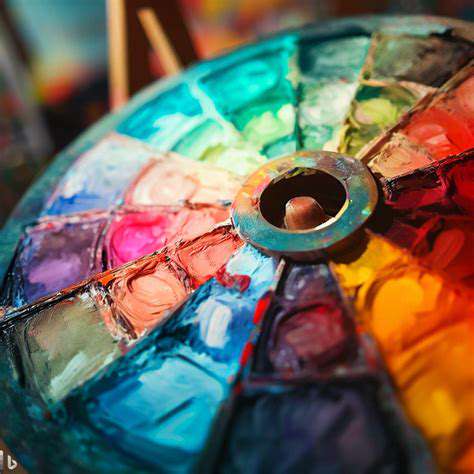
Before embarking on the exciting journey of selecting colors for your home, it's absolutely crucial to have a firm grasp of the fundamentals of color theory. This foundational knowledge encompasses elements such as the color wheel, which serves as the visual map depicting the relationships between primary, secondary, and tertiary colors. Understanding how these colors interact and complement each other is essential for creating a visually appealing and harmonious space that resonates with positive energy and a welcoming ambiance, significantly contributing to the overall aesthetic.
The color wheel provides insights into complementary colors (those directly opposite each other, like blue and orange), analogous colors (those next to each other, like blue and green), and triadic colors (those evenly spaced around the wheel, such as red, yellow, and blue). These relationships allow you to make informed decisions about color pairings, ensuring a cohesive and balanced design, thereby preventing clashes and fostering a sense of equilibrium within the chosen environment of your living space. These color pairings can dramatically change the way a room is perceived.
Furthermore, consider color temperature – understanding warm colors (reds, oranges, yellows), which evoke feelings of energy and excitement, and cool colors (blues, greens, violets), which promote a sense of calmness and tranquility. The interplay of these temperatures can affect the mood and atmosphere of a room, allowing you to tailor your color scheme to the specific purpose and personality of the space. Employing warm colors can create an environment for social interaction, while cool colors are best suited for spaces of relaxation.
Lastly, familiarize yourself with color values (lightness and darkness) and saturation (intensity). Varying the value and saturation of a color allows you to create depth and dimension within a room. Lighter shades can make a room feel more spacious and airy, while darker shades can add a sense of intimacy and coziness. Adjusting the saturation, from muted pastels to vibrant hues, gives you control over the level of visual impact and the overall emotional tone of the decor within your dwelling.
Selecting a Color Palette That Reflects Your PersonalityThe most effective color palette reflects your unique personality and the intended function of the space. Consider your lifestyle, preferences, and the message you want to communicate through your home's aesthetic. Do you crave a vibrant and energetic environment, or do you seek a sanctuary of calm and serenity? These questions guide the selection of colors that resonate with your inner self and will determine the overall feeling that your home evokes, creating a more personal and enjoyable experience.
Start by identifying your favorite colors and considering how they might translate into a cohesive scheme. Are you drawn to the warmth of earthy tones like terracotta and ochre, or do you prefer the coolness of blues and grays? Remember that your color palette doesn't have to be limited to a few colors; it can incorporate a range of hues, tints, and shades, all working together to create a well-balanced aesthetic that is visually captivating. Consider the different ways these colors might be used to highlight features of the room.
Think about the specific rooms within your home and their intended uses. A living room might benefit from a more inviting and sociable color palette, while a bedroom might call for a more restful and calming scheme. The kitchen, where cooking and gathering frequently occur, can leverage colors that stimulate appetite and encourage a sense of conviviality. Choosing colors that work with each other creates an intuitive and easy-to-navigate home that suits your specific needs.
Don’t be afraid to experiment and gather inspiration from various sources. Browse magazines, websites, and social media platforms to discover color schemes that resonate with you. Create mood boards, collecting fabric swatches, paint chips, and images that capture your desired aesthetic. This will help you visualize how different colors might work together in your space and refine your palette before committing to a full-scale transformation, ultimately helping avoid costly mistakes and ensuring satisfaction with the final result.
Utilizing Color Psychology to Evoke Desired EmotionsColor psychology plays a significant role in shaping the emotional impact of your home's atmosphere. Different colors are associated with various feelings and can influence your mood and behavior. Understanding these associations can help you create a space that supports your desired emotional state. For example, blue is often linked to tranquility and serenity, making it an ideal choice for bedrooms and bathrooms, where relaxation is paramount to well-being and a good night's rest.
Green, the color of nature, promotes feelings of harmony and balance. It can be incorporated in living rooms and home offices to create a sense of connection to the outdoors. Yellow is often associated with happiness and energy, making it suitable for kitchens and dining rooms, where it can stimulate appetite and promote a sense of conviviality. Red, a bold and passionate color, can create a sense of excitement and dynamism, and should be used in moderation as an accent color in certain areas of the home.
Consider the natural light in your home. Colors appear differently under different lighting conditions. Warm light enhances warm colors, while cool light complements cool colors. Using these lighting qualities can help accentuate the colors and make them appear their most potent and appealing. If you're not sure, test paint samples in the room and observe how they appear at different times of the day and night to ensure the best selection possible.
Beyond individual colors, consider the overall color scheme and its potential impact. A monochromatic scheme, using different shades and tints of a single color, can create a sense of elegance and sophistication. A complementary scheme, using colors opposite each other on the color wheel, can generate excitement and visual contrast. A neutral color palette can provide a calming backdrop, allowing you to introduce pops of color through accessories and artwork that further personalize your living experience.
Implementing Color Techniques for Visual Impact and FunctionalityMastering specific color techniques can drastically enhance the visual appeal and functionality of your home. One effective technique is the use of accent walls to create focal points within a room. A boldly colored wall can draw attention to a specific area, such as a fireplace or a gallery wall, adding interest and visual depth. Carefully consider the color, texture, and placement to make the most effective use of this strategic design element that can define space.
Another useful strategy involves using color to manipulate the perception of space. Lighter colors can make a room feel larger and more open, while darker colors can make a room feel smaller and more intimate. Similarly, vertical stripes can make a ceiling appear higher, while horizontal stripes can make a room seem wider. Utilize these tactics to solve spatial challenges and to amplify the overall appeal of your space to create a welcoming and inviting atmosphere.
Color blocking, a technique that involves using blocks of contrasting colors, can add a modern and dynamic touch to your home. This is often done with furniture, artwork, or even paint. This method is a great way to introduce multiple colors into a room while maintaining a sense of visual order and cohesion, enhancing the overall design of the space without overwhelming the viewer's eye. The use of different types of blocks is critical to maintaining a high aesthetic.
Consider how color interacts with the existing elements in your home. Take into account the color of your flooring, furniture, and artwork when selecting your paint colors. The colors should complement each other and create a cohesive look, rather than clashing and competing for attention. Ensuring consistency in your palette will foster a sense of harmony and ensure that the final design truly reflects your taste and enhances the overall experience within your home's atmosphere.
Beyond Paint: Integrating Color Through Décor and Furnishings
Color plays a fundamental role in shaping our emotional responses and influencing our perceptions of a space; understanding the psychology behind specific hues is essential when designing a vibrant home atmosphere. Different colors evoke different feelings; for example, warm colors like reds and oranges can stimulate energy and excitement, while cool colors such as blues and greens often promote feelings of calmness and serenity, thereby allowing you to tailor your environment to the desired mood. The intentional use of color can significantly affect the overall ambiance and functionality of a room, impacting everything from our productivity to our sense of well-being; it's more than just aesthetics, it's about creating a space that resonates with you.
Furthermore, the intensity and saturation of a color contribute to its psychological impact; lighter shades tend to create a sense of spaciousness and airiness, making a room feel larger and more open, while darker hues can create a cozy and intimate atmosphere. Choosing the right colors requires careful consideration of the natural light, the size of the room, and the intended purpose of the space; consider how you want the inhabitants to feel, the functionality needed, and the overall goals you want to accomplish within each unique part of your home. Careful planning allows you to craft a home that serves as a true reflection of your personality and that enhances your daily experiences, impacting the very core of your lifestyle.
Color Palettes: Building a Harmonious FoundationDeveloping a cohesive color palette is the key to achieving a harmonious and visually appealing home environment, as a well-curated palette ensures that colors work together to create a sense of flow and balance. Starting with a base color, like a neutral or a dominant hue, allows you to build a foundation from which to introduce accent colors and complementary shades, thereby establishing a sense of visual unity throughout your home. Consider the 60-30-10 rule, where 60% of the space is dominated by a primary color, 30% by a secondary color, and 10% by an accent color, to effectively balance a space.
Exploring different color combinations and the relationships between them can lead to exciting and unexpected results; consider using a color wheel to identify complementary, analogous, or triadic color schemes, each offering a unique aesthetic appeal. Whether you prefer a monochromatic scheme for a streamlined look or a bold mix of colors for a vibrant and dynamic feel, the key is to create a balance and ensure that the colors don’t clash, and that you consider the room size when picking the colors, because some colors are more suited to specific areas. Remember that sampling colors and testing them in your space before committing to a full-scale application is always a great idea, and you might even find your own unique combinations.
Décor as a Medium of Color ExpressionDécor elements provide an exceptional opportunity to introduce color, texture, and visual interest into your home beyond the walls, allowing you to infuse personality and flair into your living spaces. Throw pillows, blankets, rugs, artwork, and decorative accessories offer a way to experiment with different color combinations and patterns without a major commitment, providing you with a less permanent method to alter the aesthetic of your space. Textiles, for instance, can add warmth, contrast, and personality, and are relatively easy and cost-effective to switch out as your tastes evolve or seasons change.
Similarly, furniture pieces can serve as focal points, introducing key colors and creating cohesive themes throughout the home. Consider using colorful sofas, chairs, or accent tables to make a statement or choose more neutral furniture pieces to allow your artwork and accessories to take center stage. Choosing a balance of colors across décor items helps create a well-rounded and visually stimulating environment, offering a visual feast for the eyes, and adding a layer of comfort to any room, transforming the space with style and creating a reflection of your aesthetic. Strategic placement of décor items ensures that color is distributed evenly across a room, preventing any area from feeling visually heavy or unbalanced, making your house feel cohesive and alive.
Furnishings: The Foundation of Color IntegrationChoosing the right furnishings is critical for achieving a harmonious and visually appealing home, as they will serve as the structural foundation of your color scheme. The color and material of your furniture can set the tone for the entire space; choosing a sofa in a neutral tone, for instance, allows you greater flexibility with your accent colors through throw pillows, rugs, and artwork. The size and style of your furnishings are also important considerations, with larger pieces such as sofas and dining tables typically setting the stage for the color scheme.
Moreover, think about the interaction of your furnishings with the surrounding architecture and natural light, as this can impact the way colors appear in your home; the integration of color through furnishings is more than simply buying furniture with a pleasing hue; it’s about crafting a space where color acts as a unifying element. Upholstery fabrics, wood finishes, and metal accents all contribute to the overall aesthetic, making it imperative to balance the color, texture, and style of each piece. Consider incorporating furniture pieces that provide a burst of color, such as a vibrant armchair or a bold coffee table, to create focal points and draw the eye.
Read more about The role of color in creating a vibrant home atmosphere